mPulse Widget Editor
Akamai’s mPulse platform captures real user monitoring (RUM) data, surfacing key performance indicators (KPIs) that help engineers optimize website performance, understand user behavior, and measure ROI. To make this data more actionable, we designed a drag-and-drop widget builder that allowed users to create custom visualizations with ease.
Widgets could be as simple or complex as needed—standing alone for quick insights or assembled into fully customized dashboards with sharing options. The goal was to empower engineers and performance teams with a flexible, self-service tool that balanced power with simplicity.
Research & Strategy
I began with stakeholder interviews and usability reviews of existing dashboard workflows to understand how users created and used widgets in our product and in competitors. Customers wanted fast iteration—the ability to experiment with different data fields and chart types without friction. At the same time, they needed precision and control with filters, labeling, and the ability to share dashboards.
Our strategy focused on providing progressive complexity: making the default path quick and easy for basic widget creation, while allowing more advanced users to layer in customization options as needed.
The Solutions
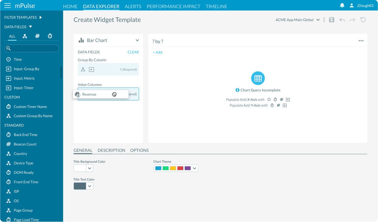
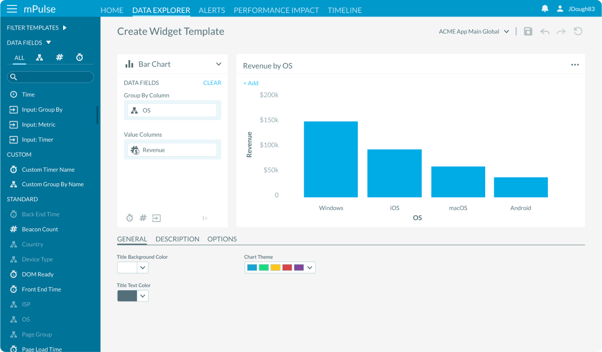
- Drag-and-Drop Sidebar: Users selected data fields from a sortable, searchable sidebar list. Tabs filtered fields into categories—Dimensions, Metrics, and Timers—making it easier to find the right data among lots of options.
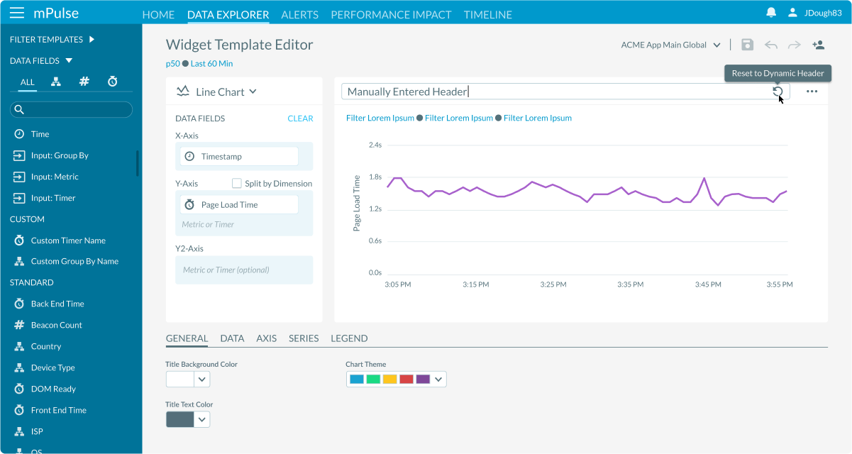
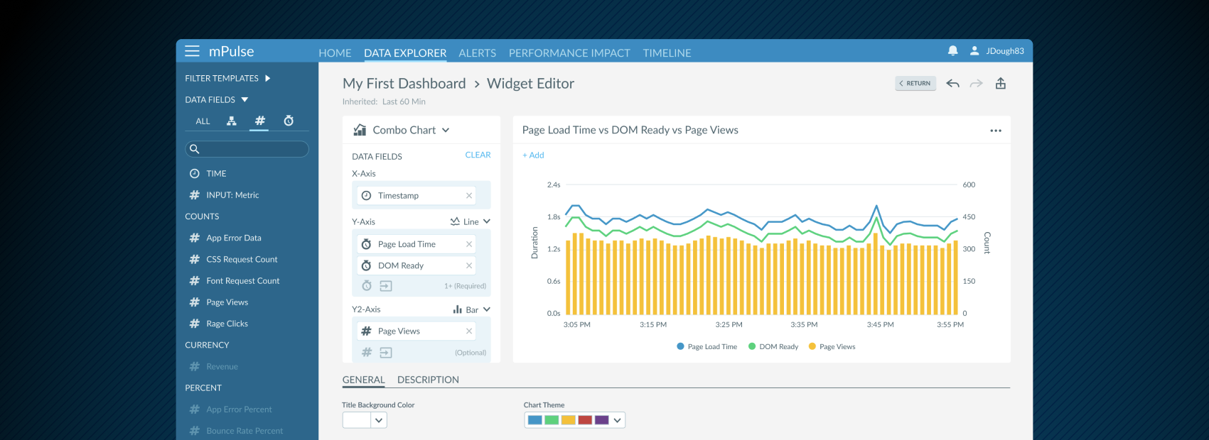
- Dynamic Updates: FDropping fields into the widget instantly updated the chart with simulated data, giving users a live preview. An auto-generated header was created for each widget, which could be manually edited or reset at any time.
- Flexible Chart Types: A dropdown menu allowed users to change chart types on the fly, with the widget re-rendering in real time.
- Contextual Options: A dedicated section enabled users to adjust color themes, add descriptions, and reveal advanced options depending on the chart type. The sidebar intelligently dimmed incompatible fields when certain data types were already selected.
- Interactive Inputs: Users could add custom input fields to make widgets more interactive, such as toggling between metrics, timers, or dimensions, without returning to the editor.
Based on these insights, I developed a design strategy focused on progressive disclosure in this task-oriented workflow.
Results & Impact
The widget builder turned a once-manual process into an interactive experience.
We were able to achieve:
- Increased Flexibility: Giving autonomy to easily visualize data.
- Increased Efficiency: Cutting down the time needed to build widgets.
- User Freedom: Reducing friction for new users while supporting advanced workflows.
Ultimately, the drag-and-drop widget creation tool empowered performance engineers to spend less time configuring dashboards and more time interpreting data and driving outcomes.