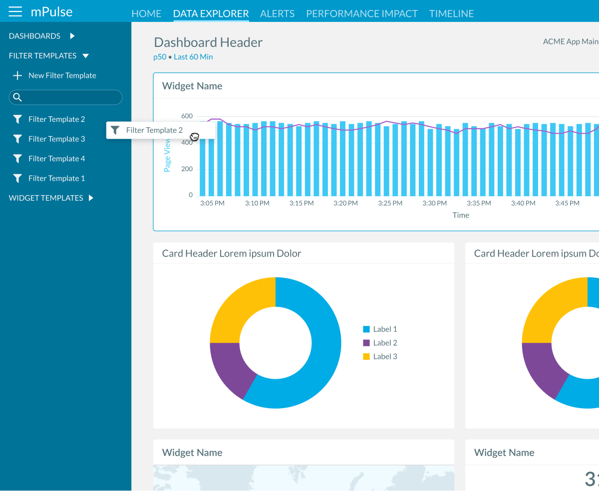
mPulse Filter Groups
Akamai’s mPulse platform captures real user monitoring (RUM) data, surfacing key performance indicators (KPIs) that help engineers optimize website performance, understand user behavior, and measure ROI. Filtering data is central to this process, but the legacy workflow created unnecessary complexity. Every available filter was surfaced in the interface—whether the user had made changes or not—resulting in a UI that felt busy, overwhelming, and difficult to scan. Each adjustment also triggered a full dashboard reload, often taking minutes, and there was no way to save commonly used filter sets—forcing users to repeat the same tasks over and over.
Research & Strategy
Through usability reviews and direct feedback from engineers, we learned that filtering was one of the most frequent actions in mPulse, yet also one of the most frustrating.
Our strategy was to:
- Reduce repetition and wait times by batching filter changes before applying them.
- Introduce saved filter sets to further eliminate repetitive work.
- Improve clarity by surfacing only filters that differed from defaults.
- Refresh the look and feel to align with modern UI patterns already established in the design system.
The Solution
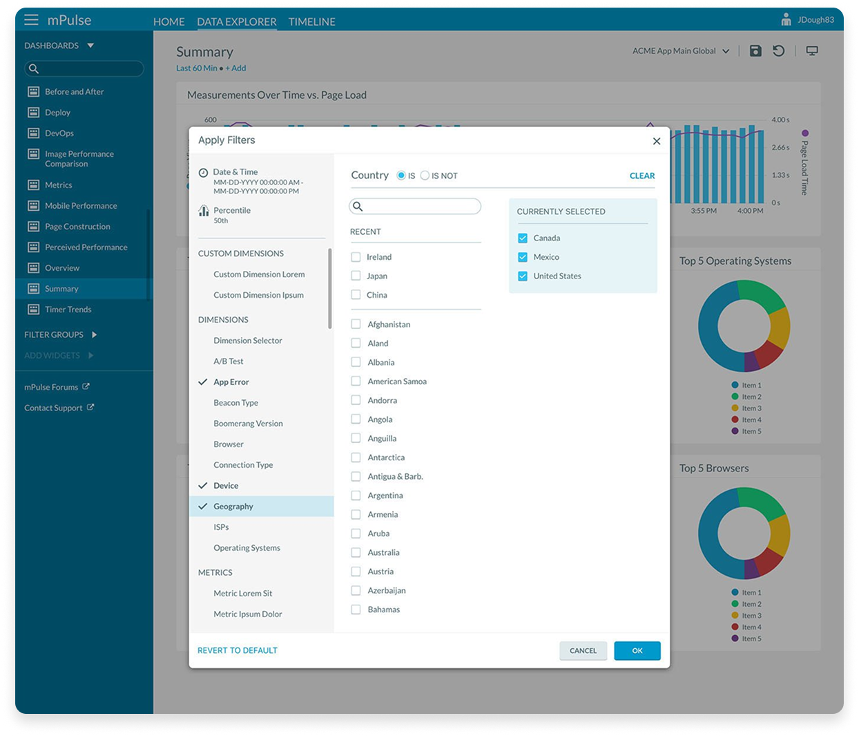
- Modal Filtering Workflow: Users now enter a modal dialogue containing all available filter options. Changes are made inside the modal and applied in a single update, cutting refresh times dramatically.
- Saved Configurations: Filter sets can be saved, named, and reused via a drag-and-drop interface, allowing teams to quickly reapply common views.
- Smart Defaults: Only filters that deviate from default settings are shown in the main view, giving users a clear at-a-glance understanding of what’s active.
- Flexible Application: Saved filters can be applied to dashboards or widgets in a single action, while remaining fully editable.
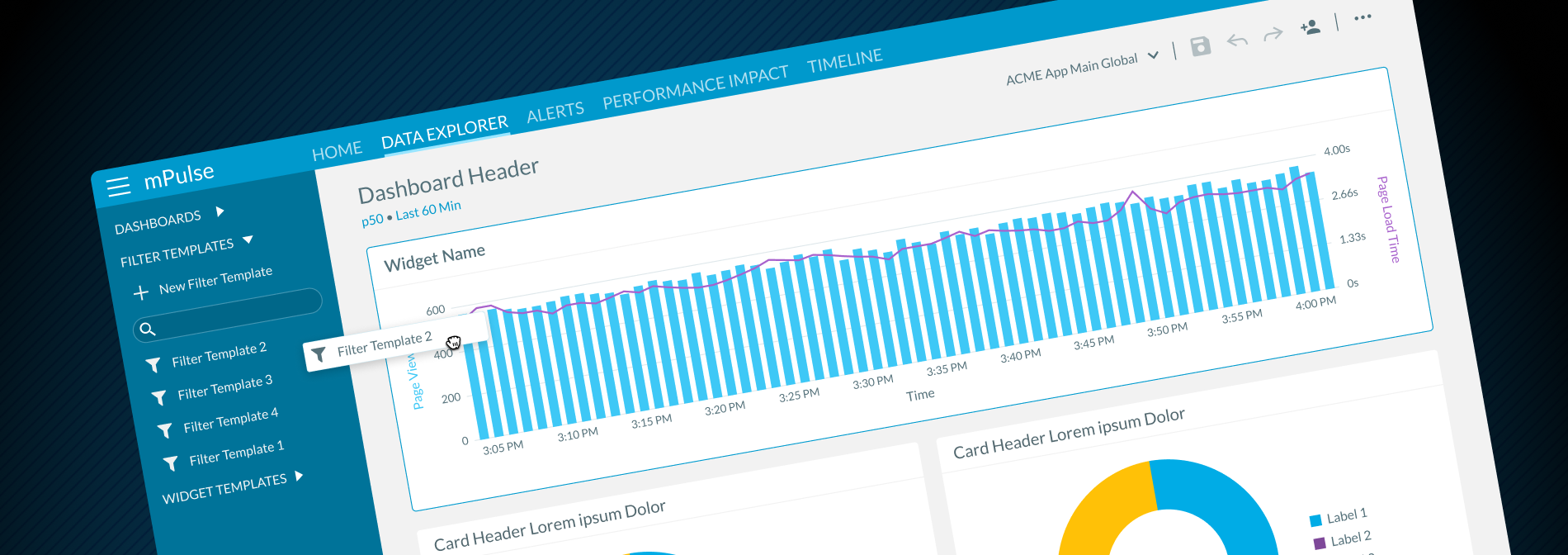
- Refreshed UI: The updated design modernized the experience, improving usability and consistency with the broader platform.
The redesigned filter feature transformed a previously slow, repetitive workflow into an efficient and reusable process. It cut down on repetitive work, reduced delays, and gave users new ways to save and manage their filter configurations with ease.